
Vince Walden - https://www.vincentwalden.com/
Lucy Hadley - https://www.lucyhadley.com/
Walden's website grabbed my attention most out of the two, off the bat his work is presented on the front page alongside a time-lapsed insight into his studio working, with the use of rollover his work acts as re-directory's into different projects he's worked on, which is a clean approach into his portfolio as it shows organization as it separate's his briefs, the use of this makes it significantly easier to navigate through his work and show his wide range of skills
Hadley's website has a different approach, her website is a lot more minimal, using an enter page similar to mine to redirect the viewer into her work, its a lot more spaced out but due to this it requires consistent scrolling to see her work, all her navigation fits onto the one page so there's no hassle in redirecting, her gallery is boxed images of her work which shows a consistent theme
Walden pros - easy, quick navigation, quick display of work with redirecting images, simple about me page, pages essentially bounce off each other for example if I click one project I can easily jump to another just from simply scrolling down
Cons - hyperlinks down at the bottom are broken - showing no thumbnail, blog page feels a bit weird as from first glance it looks broken as there nothing but there is a hyperlink above the title to redirect you to his actual blog, this is a personal con but aesthetically there is too much blue its kind of blinding
Hadley pros - everything you need is essentially on one page so you can just scroll down her entire website, simple - minimal, work is organized along side prices being shown on rollover
Cons - maybe too minimal - feels rushed everything is just flat fill colour, about is a video rather than simple text which can take away time from viewer
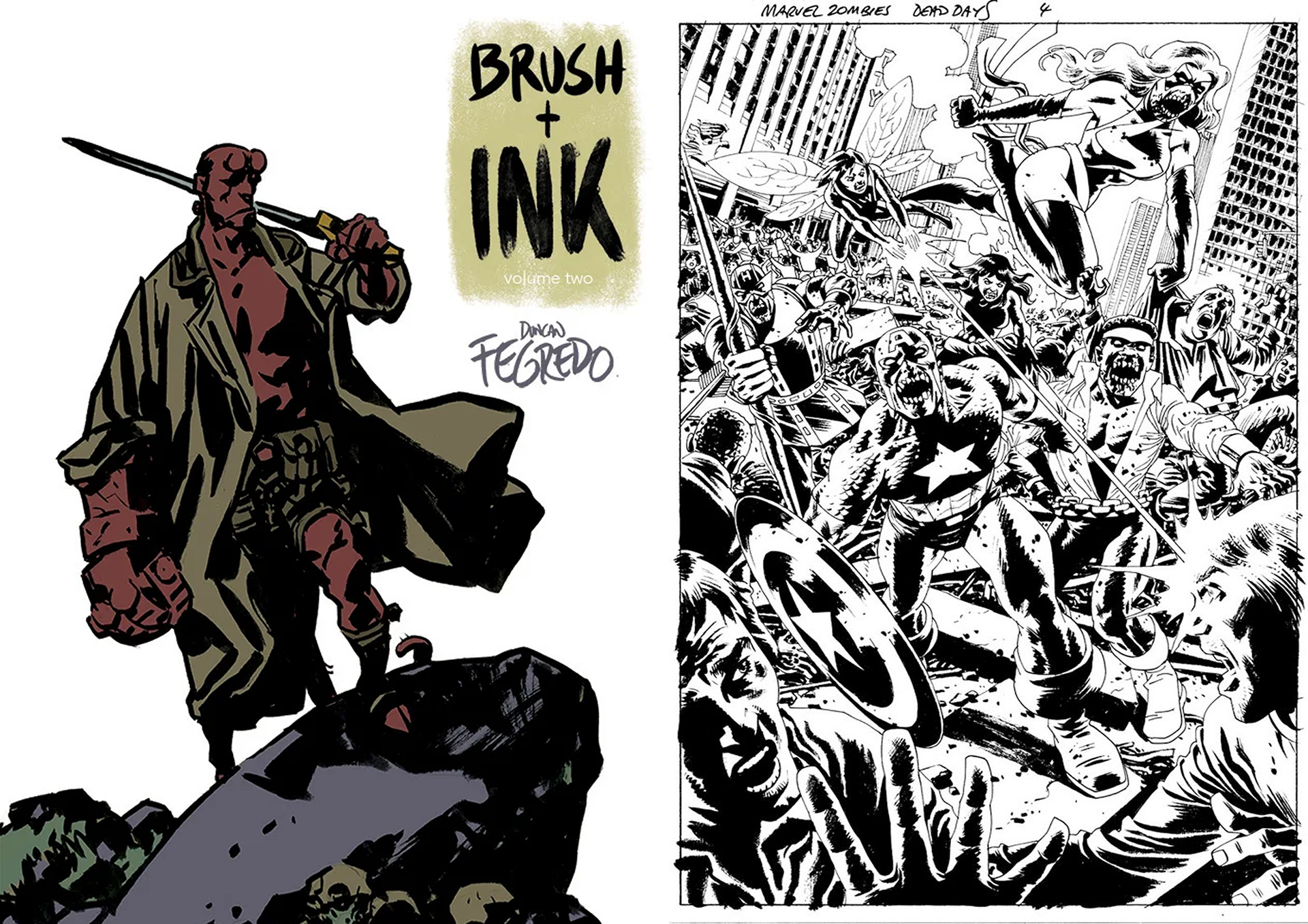
Duncan Fregredo - https://www.duncanfegredo.co.uk/
Sean Philips - http://www.seanphillips.co.uk/
Fregredo's website is unfortunately down for maintenance - N/A
Philips website is simple and clean, with easy titled navigation to his work, only his blog requires re-directory, other than that it all fits onto one page and scrolling is not necessary, his about page is the first thing you see when you open his website, its brief and concise highlighting his work experience within the field of Illustration , the irony of its website is how simple and minimal it is but his illustrative work is very detailed - possibly simple to highlight his work more?
Cons - If I'm honest I feel this website is straight to the point and clear, I can't really see any cons as all links work apart from the Amazon link to purchase his graphic novels, all I can see is alignment issues